Welcome to the Dashboard Series where we highlight best data visualization practices and real-life effective information on sales dashboards.
The Dashboard Series - The Perfect Sales Dashboard for Executives
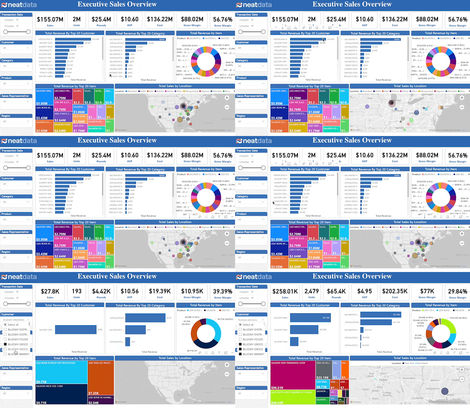
Company leadership must have a firm grasp on a company’s revenue activities. Understanding which products are selling, which product sales are waning, the impact of geography on sales, and sales rep performance are some important measures. This article outlines an execellent sales dashboard used by executives that help us understand these metrics. We highlight important dashboard capabilities and the most impactful visualizations.
The Metrics
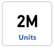
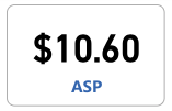
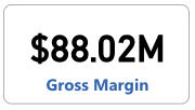
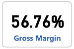
The core sales metrics are straight forward and self-explanatory. These includes sales amount, units, average sales price (ASP), cost, gross margin and gross margin percentage.
Top Customers
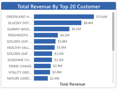
Consistent sales with sales growth depends on understanding your customers. Your top customers often make up a large amount of sales. Hence, you need a sales dashboard that creates reports and provides on your elite clientele.
Top Products
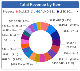
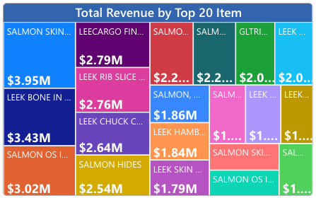
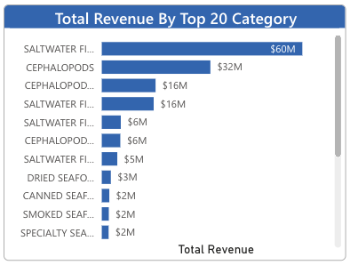
Which products represent your largest sales segments? Are there any surprises? Leaders must understand exactly which products account for revenue and sales dashboard helps them with just that.
Geography
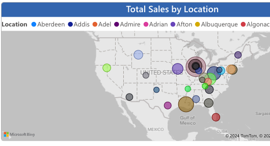
Understanding sales accoss country, state, city and zip drive many aspects of the business. Is there competition in an area? Can orders be delivered to various areas? By leveraging the insights provided by a sales dashboard, executives can optimize delivery logistics and target marketing efforts better.
Key Features
Effective sales dashboards have fundamental business user capabilities. Sales leaders are sophisiticated and expect this functionality.
Slicers
A good sales dashboard provides several means for slicing a dashboard’s data. Clicking on a chart’s pie slice or bar can cause the entire dashboard to adjust for that value. Dropdown combo boxes and buttons can also provide precise slicers.
Drill Down
Drill down is used within a visual to navigate through hierarchical data. For instance, when viewing a sales amount by sales rep chart, users may want to drill down on a single sales rep to see a summary of products sold.
Drill Through
Drill through is used to navigate to a different report page that provides more detailed information related to a selected data point. For instance, users might want to click on a sales rep in a chart and see the underslying sales transactions.
Conclusion
Sales dashboard design can be complex. Gathering the required data using a proper data pipeline, applying business logic for value transformation and information design can be daunting tasks.
But having a target dashboard, such as this sales dashboard tailored for executives and designed for use cases help provide the end goal, fosters discussion, and gives an excellent starting point.


